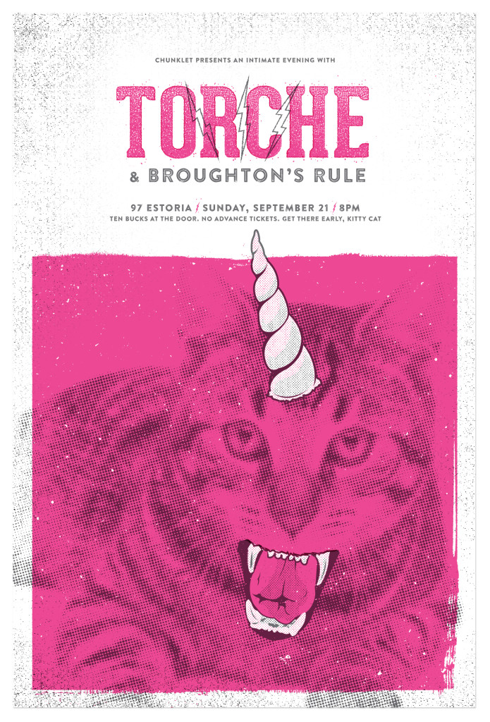
 As a kid, Atlanta graphic designer Brett Miotti passed countless hours absorbing the captivating intricacies illustrated on the record covers of his father’s album collection. Thumbing through vinyls and examining the details that told as much of a story as the music itself instilled a desire to create the same experience within his own work.
These early memories laid the groundwork for Miotti’s mutual love of design and music. Both forms of artistic expression have constantly intertwined as a motif in his life—playing in multiple bands inevitably led to designing merch and packaging. An internship at a legendary Nashville, Tenn. print shop found him wanting to build upon his skills as a visual creator. Studying graphic design in Atlanta at the Savannah College of Art & Design brought him to the city he is proud to call home.
Miotti’s work shows his appreciation for a broad spectrum of design and ability to adapt to different styles and voices. He has crafted his own distinct aesthetic that focuses on blending clean design with a bit of “tooth” to it. His incorporation of texture gives an inviting warmth and history to his stories. Currently, he’s working on a variety of collaborations with other Atlanta artists, bringing Pretty Likable Press back to Indie Craft Experience and of course, lending his creative eye to a variety of brands in the city.
CommonCreativ chatted with Brett to find out more about his path as a designer, trusting in his imagination and why Atlanta rules as a city for creatives.
CommonCreativ: How did you find your path as a designer?
Brett Miotti: I have two great loves in life: music and art/design. My father had a respectable record collection and as a child I would sit and just stare at the packaging detail of each record. I knew creating that experience was something I wanted to do. However, at the end of high school (and four years of art classes with the same instructor), I was a bit burned out and very undisciplined. I turned more towards creating music. While playing in bands I would constantly find myself making flyers, t-shirt designs, and having a strong opinion about the packaging of the music.
After some mild success with two different bands and a move to a different state, I realized I needed to rethink some goals. The only thing I thought I might enjoy as much as creating music was creating art again. It had been some time since I really focused on that, and I became more aware of the graphic design field. Reluctantly, I put myself back in school—sure that I would fail miserably. Quickly I found myself with an internship at the best place to be an intern in Nashville, Tenn., Hatch Show Print, and from there I convinced myself to go to a “more serious” art school. That’s how I wound up in Atlanta.
CC: How did you develop your style?
BM: Everything still stems from looking at my dad’s records. But I think I really made those first made steps towards the designer I would become when I interned at Hatch Show Print, a letterpress shop known for their posters created for the Grand Ole Opry and other artists. Posters for Johnny Cash, Willy Nelson, Elvis Presley and Huey the Cat (RIP Whiskers!) line the walls of this shop. I was fortunate to work with the very same tools that were used in the making of these historic posters. Playing with tangible wood and metal type for seven months straight taught me a lot about typography and the “physical” space of design. In addition, I had immense admiration for designers cranking out screen-printed gig posters. Other than pushing myself to do better than the last time with each new project, I’m constantly meditating on a quote from one of the modern masters of design, Paul Rand: “Don’t try to be original, just try to be good.” The take-away from that is that worrying too much about being different or better than the next guy can be distracting and make the end goal harder than it needs to be. I’m still “developing” my style to this day.
CC: Could you describe your creative process?
BM: Fake it ’till you make it. (I kid.) It’s hard to say. I see a lot of beautiful work done by other artists and designers that I admire, and I think about the emotional reaction I have to that, and then I think, “How can I create something that makes someone else feel that way?” With a poster, I try to create an image that’s memorable. Not long ago, I was asked to design a poster for the band Torche, a pretty heavy/aggressive band. Initially I had this idea based on one of my favorite songs of theirs. I soon realized that the idea would have ended up looking like every other poster I’d seen for them. I was looking at their Instagram feed and noticed a lot of pictures of cats. So I found an image of this little kitten but then drew this fierce looking mouth and a unicorn’s horn on it. The end result was something that matched the intensity of the band and yet was a bit playful and shocking. As far as approach or technique, it’s a mix of interesting and thought-out typography, maybe some found imagery that is manipulated via collage or coupled with some illustration.
CC: What have been some of your favorite projects to work on?
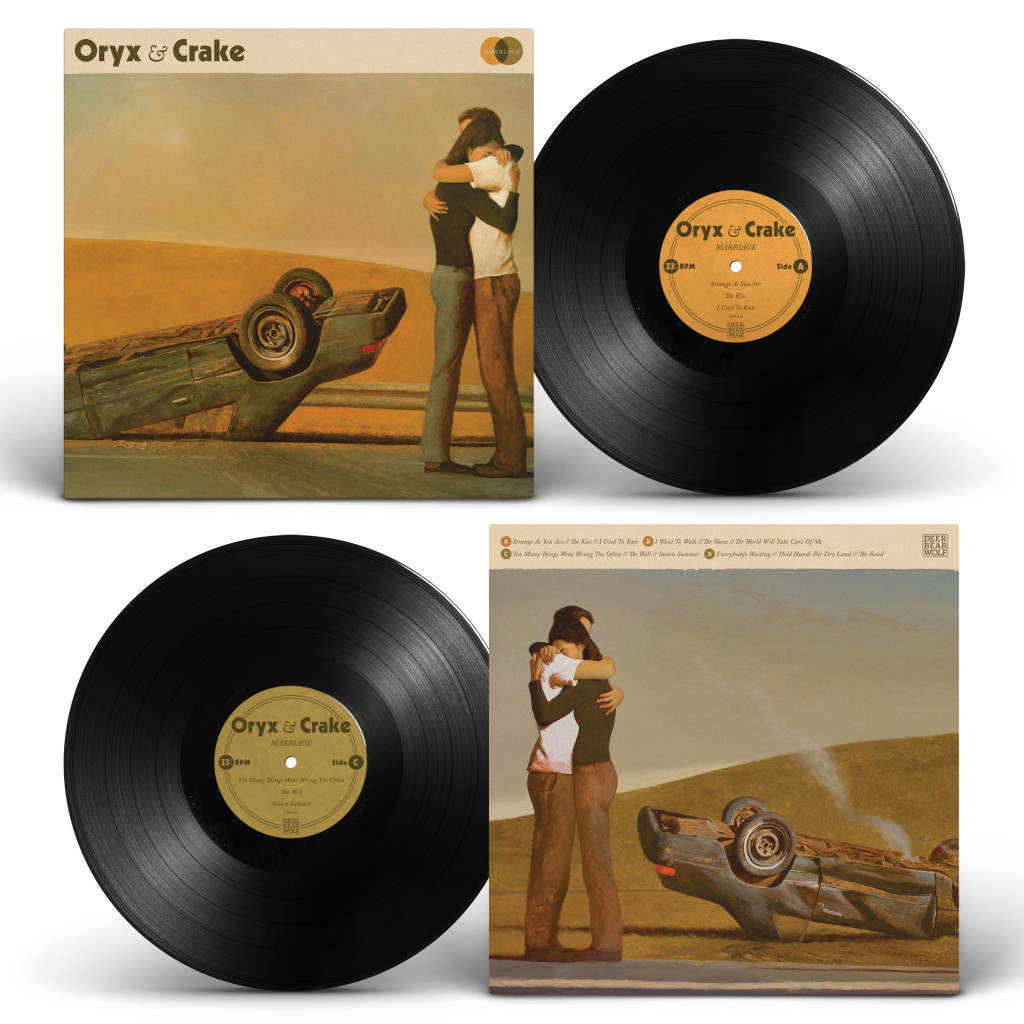
BM: The first thing that comes to mind is the new Oryx & Crake record, Marriage, which was very challenging in that the band had these two beautiful paintings from artist Bo Bartlett that they wanted to serve as the front and back cover. I wanted to make sure the layout and typography didn’t overpower or distract from the images—the design needed to work in service of the paintings and the story the band was trying to tell with this record. I thoroughly enjoyed talking with the band about this project—we talked a lot about music and the concept they wanted to bring to life, and you could tell that all parties involved were very passionate. If you’ve ever met Ryan and Rebekah, they are two of the most genuine people on the face of this earth.
CC: You’ve worked with some big-name brands—how do you authentically promote yourself as an artist?
BM: I’m still trying to figure that out. Any association with a “bigger brand” is either by chance or necessity. Bills need to be paid too. But the nice thing about working with those brands is that it creates more visibility for my work or my name to come across someone else’s radar who’s got an interesting project for me to potentially work on. Right now I work full-time as a creative manager/art director for a pretty well-known company. It’s not my heart, but it allows me to chase what makes my heart flutter in terms of “fun” or “fulfilling” projects on the side. I do work with great people there and it’s teaching me a lot about myself, but I teeter back and forth between keeping the “fun stuff” more of an extracurricular activity or pulling the trigger on trying to be my own boss.
CC: Do you have any advice for designers who are starting out?
BM: Yes—prepare for heartbreak. And expect to be misunderstood…often. If those things haven’t deterred you from being a designer, then you’ve accomplished half of what it takes. Practicing design can be a very rewarding thing but it can entail a lot of putting up with b.s. and uninformed opinions. Was that too honest?
CC: What are some of your favorite projects and who are some of your favorite artists in Atlanta?
BM: Shit, this could get really long. Someone I respect greatly once told me that a lot of cities have a great impact on a person, whereas Atlanta is a city where a person can easily have an impact on the city. I find this to be true. A lot of the people making and doing things here are what make this city so great, be it food, music, art, et cetera. That said, a few artists who quickly come to mind are the insanely talented Ashley Anderson; the force of nature that is Laura Relyea; Henry Owings, who is a man of many talents and has also been a huge encouragement lately; everything to do with Living Walls; Brian Manley, who, in addition to being a highly underrated designer, might just be my life coach whether he realizes it or not; and I really dig everything Deer Bear Wolf has their hands on, Phoenix Fest and all the books and music they are putting out.
 CC: When you’re not designing, where do you spend your time in Atlanta?
BM: Probably at Criminal Records buying way too many records—ha. I also really love driving around and hanging out anywhere in Inman Park, Little Five Points, East Atlanta Village and Grant Park. That whole side of town seems to vibrate on the same frequency as my soul.
CC: What are your thoughts on Atlanta’s creative scene right now?
BM: Nothing but love, really. In addition to those mentioned earlier I’ve fallen in love with the person and artist Kyle Brooks (aka Black Cat Tips). That guy is on another planet in the best way possible. I’ve been working on a project with him and some fellow screen-printers for the better part of this year that I hope to launch soon. I really love that there’s a healthy mix of designers, illustrators, crafters, painters and writers in this city. In no other city have I felt so connected to a wealth of creative people who make for an exciting community of artists.
CC: What’s up next for you?
BM: I’ll be at Holiday ICE and hopefully Phoenix Fest hocking my wares. In addition to that is what I’ve been working on with Black Cat Tips, Kevin from Factory Press and David Broughton from Baron Press. It’s an idea that sort of originated with my girlfriend, Samantha, who used to do a lot screen-printing with me. She kind of slowed down on that front and I selfishly took the idea to Kevin thinking that nothing would ever come of it. Enter my friend Jason Dominy who encouraged us to follow through on it and got Kyle involved, and we started down this path. It’s mostly done, we just need to put some finishing touches on it, and then we want to put on a show that showcases the work and somehow gives back to the arts in Atlanta. We’ve tossed around a few organizations we’d all like to love on and then Matt and Davy from Deer Bear Wolf have expressed interest in helping us with the event… so we’ll see.
You can see more of Brett Miotti’s projects in his portfolio .

