When Jacob Escobedo moved to Atlanta, he didn’t have a job. A Nevada native who grew up in a desert town outside of Las Vegas, he relocated after marrying his Tennessean wife. But he didn’t stay unemployed for long.
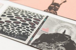
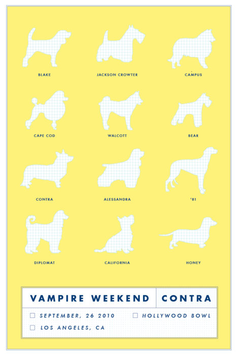
The artist and designer worked his way up from freelancing for Cartoon Network to his current role as creative director for Adult Swim. He’s also created album artwork for music acts like Gnarls Barkley, Jack White and Norah Jones, Broken Bells and, most recently, the Shins.
Escobedo has since been successfully converted to a lover of the south thanks to Atlanta’s quirky charms. He currently lives in Grant Park with his wife, three daughters and two dogs, one of which is named Cornelius due to his uncanny
resemblance to a character from Planet of the Apes.
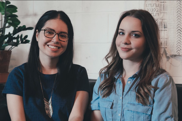
CommonCreativ spoke with Escobedo about his creative process, his favorite spots in Atlanta and what inspires him.
CommonCreativ: What brought you to Atlanta?
Jacob Escobedo: I’m originally from Nevada, so my heart is in the West. I went to school at the University of Utah. My first year there I met a Southern girl in the art department. We fell in love and several years later we got married. She’s from Knoxville, Tenn., so we decided to move out here and be closer to her family in 1998 or ‘99. I’ve come around – I really love the South. I didn’t know anything about it until I moved here, but now it’s a part of me.
CC: What’s your process for creating album artwork?
JE: I approach every album differently. It’s hard to nail down a process for me. It usually just happens naturally. In general, I get the music, sit with it and try to understand what kind of vibe they’re going for. I see if I can pull out anything from the lyrics that might translate into something visual. Then I start sketching and pull together materials that might inspire me. Oftentimes, I’ll go to bookstores, record stores or thrift stores, just finding old things. You never know when or where something’s going to hit you and inspire you. Then I’ll sit down and work out some imagery by scanning stuff and morphing it on the computer. I try to never start anything on the computer. It’s always something I’m doing by hand first.
CC: How does the music factor in to your inspiration?
JE: The art never really shapes up until I get the music. It’s easier for me to think about visuals after I’ve been listening to the record for a while. The Shins [album] was a good example of this. When they sent me the record, we had gone through several rounds of visuals before they were done recording. They liked everything, but they didn’t see any of the images as something that would stick. There was one song called “Port of Morrow,” which I believe at the time was titled “Drama.” I just sat and listened to that over and over.
CC: How did that song inspire you?
JE: The lyrics paint this picture of trying to tell your kids about mortality. James [Mercer (vocals, guitar)] has a couple of daughters as well. It’s this haunting, dark song, so I started going towards dark imagery and spirits. That’s where the
mountain came from. It’s very different from the one that’s on there now, but that initial image came from that song. I don’t know if it happened this way, but I came up with that cover and told him where I got the inspiration, and they ended up focusing on that song after that.
CC: How did you first get involved with Adult Swim?
JE: I had a portfolio of illustrations and things, and somebody mentioned bringing my portfolio into [Cartoon Network]. At the time I wasn’t really good at Illustrator, Photoshop or anything on the computer. I brought in this pile of paintings and went through them with the art director. I was sweating, thinking he wasn’t going like any of it. And I got called back. This was in 1999 or 2000. Then I freelanced for about six months before I got a design position. In 2002 or 2003 they started talking about Adult Swim. The minute I heard about this new block of programming I offered to be put on the project.
CC: You’ve said you feel most inspired at home. How so?
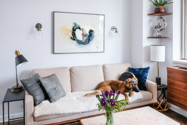
JE: We live in an old Victorian house in Grant Park. It was built in 1904. It’s actually Margaret Mitchell’s aunt’s house. One of my favorite objects is this taxidermy fox my kids have named Pepper. We’ve got a bunch of taxidermies. I’ve got dominos made from bones that my dad got in Mexico. We’ve got this incredible painting from the 1800s called “Pharaoh’s Horses” by John Frederick Herring. It’s this dark 4 feet by 4 feet painting of three horses with terrifying faces. Then the entrance to our house is filled with my dad’s pencil drawings. He was a self-taught artist, always drawing on
butcher paper or whatever scraps he could find.
CC: What are some of your favorite places around Atlanta?
JE: I love Ria’s Bluebird. That’s my favorite place on earth. I go there maybe twice a week – we live right around the corner. Oakland Cemetery is awesome. I love all those old custom mausoleums wealthy people create for themselves when they die. I love Grant Park in general. I also like to go to Book Nook in Decatur. They’ve got a great collection of used paperbacks, which I love to collect. I love Arabia Mountain. It’s this secret place nobody knows about. Every spring, pools of water form all over the outcrop. This rare form of red lichen blooms in these pools. It’s beautiful – I highly recommend it.
CC: Who are some of your favorite local artists and why?
JE: When I first got here, I kept seeing R. Land’s art everywhere. I love his stuff. Fortunately, I’ve been able to work with him at Adult Swim. We’ve had him do stuff for Squidbillies, Aqua Teen Hunger Force and other projects. All the designers and illustrators and artists I work with at the network are amazing. Joe Veazey and Brandon Collins are incredible. Brandon works here at the network. And I’m always inspired by my kids. They’re constantly drawing. My daughter Olivia drew this ghost on a napkin with high-heeled boots when she was five. I ended up using it for a poster for Ghostface Killah. Then I submitted it to a print magazine and she made it in to print.
CC: Is your wife an artist?
JE: She is. She’s a great painter – some of the greatest paintings I’ve seen. About 10 years ago, she did a series of handbags all on blank backgrounds, because she felt handbags said a lot about people. I really like those paintings – they inspire me.
CC: What upcoming projects do you have on the horizon?
JE: Things are quieting down after the Shins, but I’m still working on more tour posters and a bunch of merch for them. I’m working on an album for Waxploitation right now called Future Sounds of Buenos Aires, a compilation of electro bands from Buenos Aires. Then I’m working on a couple of projects with Danielle Luppi, who did the Rome album with Danger Mouse. Then Pat Grossi from Active Child is hitting me up, so I might be getting into something with him soon.
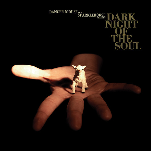
CC: You worked with David Lynch on the Dark Night of the Soul album cover
for Sparklehorse and Danger Mouse. How did that come about?
JE: I think they had all been sitting around watching David Lynch movies when making that album. They decided they were going reach out to David Lynch to do the photography for the album, and he agreed to it. I was so thrilled when I heard he was going to be involved. When all of the photos came in, I started working with his images and making all these covers. Every cover I sent, David Lynch just didn’t like it. The only response I got from him was this email in all caps, they may have been italicized as well. It just said “TRY HARDER.” There were another couple of sentences I’m sure, but that’s all I remember. I had fever dreams about it. But I always think that was the best advice. There’s nothing else to say sometimes.

